Case study · ecommerce · checkout

Trust at the payment step: When security badges help, and when they backfire

An interactive pattern case study: why shoppers hesitate at the card form, which trust signals help, why a wall of badges can backfire, and how to test payment trust.

Pattern analysis

Slide 1 of 10

The pattern: the payment step that looks like a different site

Many shops have a polished checkout until the card form, which suddenly looks plainer, uses different fonts, or sits in a frame from the payment provider. To a shopper, that's the moment their money is at stake.

Phil uses a composite shop, Copper Kettle Kitchenware, to show the pattern.

Phil says: Being secure and looking secure are two different jobs. The shopper can only see the second one.

Slide 2 of 10

WXM 1 · Wonder (Look)

Wonder: where checkout stalls

The team checks payment tracking, then looks at the last steps of checkout.

  1. A large share of shoppers who reach the payment step don't submit the form.
  2. Form analytics: many start typing the card number, then stop.
  3. Payment errors aren't the cause: declines are a small share of attempts.
Payment step drop-off (composite example) Original wireframe, not a screenshot.
  1. Second thoughts. Shoppers start entering card details, then stop.

Slide 3 of 10

WXM 1 · Wonder (Look)

Wonder: why do they stop?

Recordings of the payment step, plus a one-question exit survey.

  1. Recordings: shoppers scroll around the payment page, open the footer, look for contact details.
  2. Survey: "The card page looked dodgy", "Didn't see PayPal", "Not sure who's taking the payment".
  3. This matches published research: 19% of US abandoners in Baymard's survey didn't trust the site with their card information. [Source](#src-baymard-checkout)

Slide 4 of 10

WXM 1 · Wonder (Look)

Wonder: what the shopper sees today

The card form uses the provider's default style and sits under a row of six unfamiliar badges.

Control (A)
Payment step, current version Original wireframe, not a screenshot.
  1. Badge wall. Unfamiliar badges add noise and can look like they're compensating.
  2. Looks different. The form doesn't look like the rest of the shop.

Slide 5 of 10

WXM 2 · Architect (Plan)

Architect: from evidence to a hypothesis

Because shoppers stop after starting the card field and survey answers mention the page looking unsafe and missing payment options, we believe styling the card form like the rest of checkout, offering the main wallet options above it, showing who takes the payment and how to get help, and replacing the badge row with one clear security note, will increase completed payments per visitor reaching the payment step, because the step will look as trustworthy as it is.

Your turn: Which trust signal is NOT acceptable?
Show Phil’s answer

A '100% secure, guaranteed' badge the shop designed itself. A made-up guarantee badge is a claim nobody verified. Real information (who processes the payment, how to get help) is honest and useful.

Slide 6 of 10

WXM 2 · Architect (Plan)

Architect: how does it score on PXL?

Above the fold on a step every buyer passes, noticeable, backed by survey and analytics evidence. It changes several elements, so it's a bundle of related changes, not a single one.

PXL score: 10 / 14

PXL criteria breakdown
Is the change above the fold?Yes1
Is it noticeable within 5 seconds?Yes2
Does it add or remove an element?Yes2
Is it designed to increase user motivation?Yes1
Does it run on high-traffic page(s)?Yes1
Does it address an issue found in user testing?No0
Does it address an issue found in qualitative feedback (surveys, polls, interviews)?Yes1
Does it address insights found in digital analytics?Yes1
Is it supported by mouse-tracking heatmaps or eye tracking?No0
Ease of implementationUnder 2 days1

PXL by CXL. A high score ranks an idea; it does not predict a win.

Slide 7 of 10

WXM 3 · Validate (Test)

Validate: the variation

Wallet buttons first, a card form in the shop's own style, one short security note naming the payment provider, and visible help details.

Control (A)
A: badge wall and default form Original wireframe, not a screenshot.
Variation (B)
B: consistent form, familiar options, one honest note Original wireframe, not a screenshot.
  1. One true sentence. Who handles the card, in plain words, instead of six badges.

Slide 8 of 10

WXM 3 · Validate (Test)

Validate: the test plan, written before launch

Fixed in advance:
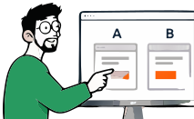
  1. Primary metric: completed payments per visitor who reaches the payment step.
  2. Guardrails: payment errors and declines, fraud flags, refunds.
  3. Because it's a bundle, a win tells you the package works, not which part. Plan follow-up tests if you need to know.
  4. QA: every wallet and card type in test mode; error messages; screen reader labels on every field.
  5. Decision rule: ship if completed payments improve with no rise in errors or fraud.

Phil says: Bundled changes are fine when you need impact. Just don't pretend you know which piece did it.

Slide 9 of 10

WXM 4 · Expand (Grow)

Expand: what the pattern usually leads to

This is a pattern, not a report of one company's test. Typical next steps for each outcome:

  1. Win: test the pieces separately (wallets first, then the note) to learn which matters most.
  2. Inconclusive: trust may not be the main issue. Look at total cost and delivery earlier in checkout.
  3. Loss: check whether wallet buttons distracted card users, or the note raised doubts nobody had.

Slide 10 of 10

Your turn

Go to your payment step on a phone. Does it look like the same shop as your product pages? Can you see who processes the payment and how to get help? Use the checkout checklist to check the rest.

What this pattern teaches

  • Wonder used form analytics to find hesitation after starting the card field, and research to find why.
  • Architect replaced decoration with real information, and ruled out invented guarantees.
  • Validate was honest that a bundle tests the package, not each piece.
  • Expand planned follow-ups to separate the pieces.

Copper Kettle Kitchenware is a composite store used to illustrate a common pattern.

Frequently asked questions

Do trust badges increase checkout conversion?

Sometimes, but not reliably. Shoppers judge safety from the whole payment step: whether the form looks consistent and secure, whether familiar payment methods are offered, and whether contact details are visible. Badges nobody recognises add clutter. Test changes on completed payments.

Is this based on a real company?

No. It describes a pattern seen across many online shops, illustrated with a composite store. It doesn't attribute results to any company.

Sources (3)

  1. 50 Cart Abandonment Rate Statistics 2026. Baymard Institute. Accessed 12 November 2026.
  2. WXM: the Wave Experimentation Model. Wavesy. Accessed 4 November 2026.
  3. PXL: A Better Way to Prioritize Your A/B Tests. CXL. Accessed 4 November 2026.

Learn the principles behind this case

Search lessons, guides, case studies and templates. Press Esc to close.